Book covers are a process. Especially now that book covers as we knew, and used to create them, no longer exist. When I designed my first book and magazine covers in the early 1990s, it was still a world of brick-and-mortar retail, and covers were meant to draw the eye from a distance while sitting on a crowded shelf of competitors.
In 2016, you live and die off the teeny-tiny thumbnail icon of your “cover” in the “Customers Who Bought This Item Also Bought” sidebar beneath an Amazon listing. Increasingly, that already tiny icon is being viewed on a 4″ smartphone screen.
It’s not that the old tried and true factors of book selling, and drawing the eye, don’t apply — reds still sell, eye contact with a subject is a huge bonus, ‘hero’ the author over the title if they’re a celebrity, reverse it if you’re launching a series, etc. But knowing how an increasing percentage of potential new readers are shopping or being converted to buying your wares changes things.
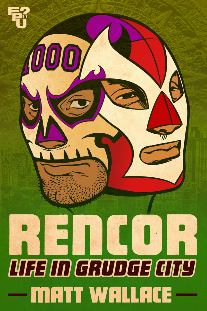
I went around with a lot of designs on Rencor, based largely on the TV pitch kit we had floating around a producer’s office or two in Hollywood. But then a happy accident turned a key that was in the lock, clicked, and yielded a cover that seems to be doing the job out there.
But let’s look at how I got there:

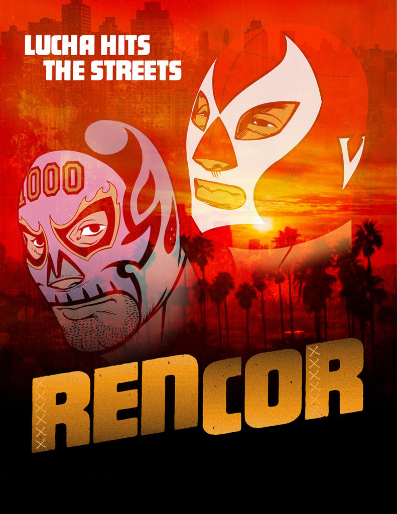
This was the cover to a pitch kit for a 13-episode Rencor TV series. I had commissioned two illustrations from long-time FPU contributor Jesse Justice to help visualize the two leads, but the rest of the kit was all photographic reference.

When we decided to unleash the story as prose, just to get something out in the world, I tried several iterations of that pitch kit cover. I would have been maybe 70% happy if any of these had been the final, but there were some concerns about how it ‘read’ at the small icon sizes online, especially considering there would be very little physical book shelving of this tome out in the real world.

I had other concerns. Did this look too much like a graphic novel or comic book issue, thus misrepresenting itself? Was it too confusing for the unfamiliar? Were two enmascarados too much,when one would be more iconic and easier to mentally process? But the book’s content was so ingrained in the pairing of these two characters, using just one of them wouldn’t do.

I was stonewalled with this design below, which made the two heads more like a single discrete element, but still wasn’t quite there. I needed a transitional element in between the faceplates, or a border device of some sort. I thought of commissioning Jesse to do a mummy’s arm. It would do the trick in the artwork, and suggest the presence of supernatural elements and monsters in the book. Then I had second thoughts on revealing that much on the cover.

Then one night I was playing with some other layering ideas, when I accidentally stumbled on this combined image:

Yep, just pushing one layer over another while aimlessly poking around with layouts and BLAM. With some quick masking, and later another round of compositing to give each masked man equal weight, and I had the best of the both worlds — the two characters, but in one single eye drawing entity.
Color variants would ensue…

But eventually I settled on the monochrome red scheme from the mummy arm design a few versions back, thinking subsequent books (if interest merits) could be executed in similar purple and green schemes. Would be a nice trilogy look in that ‘customers also bought’ bar on Amazon…
The final Rencor cover cover would use the combo-heads, with some added texture and color variations to suggest some depth. I simplified the logo block from the earlier versions, losing the mask lace motif that ultimately just cluttered up the letterforms.

I love designing books. I just wish I loved selling them as much, later. That’s the part I don’t do nearly as well.
So with that in mind, if you haven’t picked up Matt Wallace’s Rencor: Life in Grudge City yet, you can do so now at Amazon.
